Your UX Designer should be delivering a working HTML prototype, not a picture of your application from Sketch or Photoshop.
I’m not going to get too deep into our entire “Discovery” process. I’m going to skip past the deliverables you would expect to have done before you enter the design stage or your project. But for the record, before you even start to think about design you really should go through a full discovery of what you’re trying to accomplish. For example, our discovery process looks like this:
- Define Goals
- User Personas
- Voice & Tone
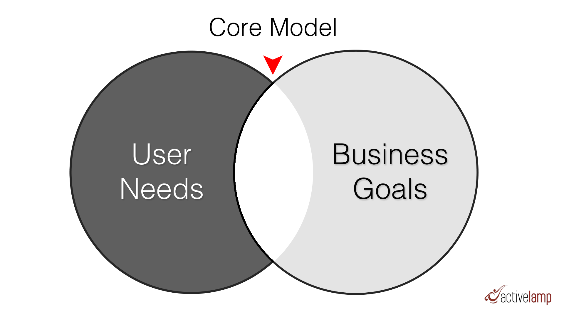
- Core Model
- Content Model
- Sitemap
- Wireframes
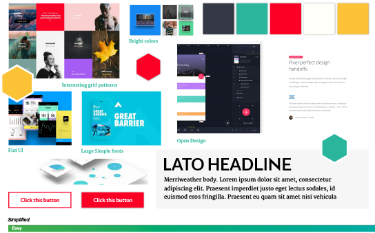
- Mood Boards
- User Interface Design
You want to first define your goals and objectives of the site, then develop user personas around who is using the site, establish what your voice & tone will be on the website or app. For example is your content quick and to the point or friendly and unassuming of your users. Next you want to create a core model to define what is important to your users and what is important to the business, and figure out what is in the nexus of those needs. After all that you can get into defining your content model, sitemap and wireframes. We are going to jump straight to the design process: Mood Boards and User Interface design.

Before you start any design it’s important to understand the design direction you want to go in. This is typically done using mood boards, which is a design artifact with various design elements of what your user interface could look like. Your designer will typically create this in a graphics program like Sketch, and the deliverable is typically a picture, for your stake holders to review. These mood boards will drive the direction of the user interface you will be creating.

Once your designer has direction, he'll start to mock things out in a graphics program like Sketch and start either designing the individual components of the site, if they've adopted the atomic design approach, or they may just jump to designing full page mock-ups of each of the different style pages.
But this is where some designers stop the design process. They finish their photoshop comps and hand them to the development team to implement.
What! Users don’t just look at websites and say wow that’s pretty, they interact with them as well. How do you know your design works?
As Steve Jobs once said — “Design is not just what it looks like and feels like. Design is how it works.”
You can build a beautifully designed user interface, but if it doesn’t function in a way that is easy for users to actually use, you end up with a useless website that no one visits because they hate the user experience.
There is another popular phrase that Louis Sullivan coined — "Form follows function”. How things aesthetically look should come after how the thing should work. That’s why our Discovery process has all of those prerequisites before we actually get to the design stage. The website and application must function for our users and then look pretty.
There is another level of design that needs to take place after the mock-ups are complete, the Interaction Design.
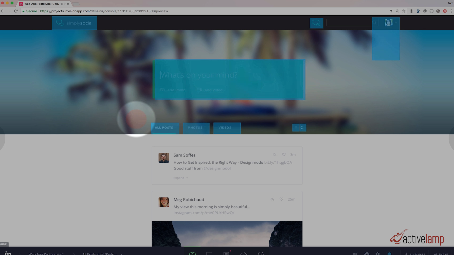
My opinion is you should create an HTML prototype for this. You could use a tool like InVision App to replicate interactions by making clickable boxes on top of the mock-up, to simulate interactions, but in my opinion that is a sub par approach for many reasons.

You aren’t seeing the design in it’s true form, it’s still just a picture. What if font size in InVisionApp looks like it’s 14 pixels where in reality it’s 18 pixels, the picture in InVision App was just showing the entire picture a little bit smaller than it should be. That could be super frustrating to stake holders once they see the implementation in a browser being slightly different than what they saw in InVision App.
How about responsive design? How do you demonstrate responsive design with a mock-up? It’s much easier to demo that in a browser by dragging the corner of the browser window and resizing to see how things look at each view port size.
Another advantage of creating an HTML prototype is that you can actually send the design prototype to a usability and accessibility lab to get real world metrics of how usable and accessible your app is, before you actually spend the development resources to build your app. Now I know that process isn’t for everyone, but if you’re working in government or higher education, this type of testing is expected.
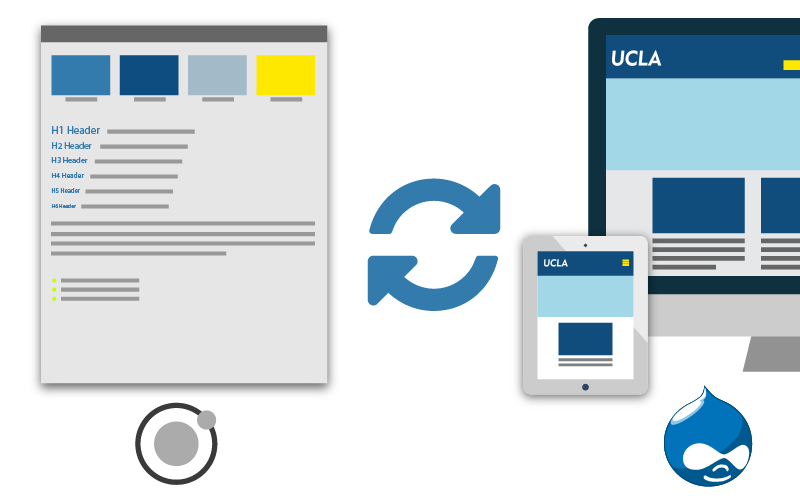
I think the biggest advantage of creating an HTML design prototype is that if your website or app can some how use the same HTML, CSS, and Javascript that’s in the prototype, then you’re only creating these templates once, in the prototype. What if you could configure your website to use all of the user interface code from the prototype. Your website would not define any HTML, CSS, or Javascript to create the user interface, all of that would be pulled in from the prototype.
If the website and prototype could share code, you would be eliminating the step of converting the HTML, CSS, and Javascript to work specifically with your application framework, whether that be Drupal, Laravel, Angular, you name it. You're eliminating a very timely and costly step of converting CSS to work in your app.
The design output of your website would no longer be the responsibility of the developer that converted the HTML and CSS, it would be the responsibility of the UX Designer.
Also, your designer and developer would no longer bump heads if a design was 2 pixels off from the mock-up, the designer would just fix those issues in the prototype, and the developer would pull the new prototype code into the app.

All of this is possible, with the help of a design system called Pattern Lab. Our UX Designers can build out prototypes in Pattern Lab, and we can pull in all of the HTML, CSS, and Javascript into our application and reuse the code.

The design of the website or app is essentially decoupled from the application. What this means is if you took this approach, you could move your design to any other application framework with relative ease. Want to move from Drupal 7 to Drupal 8, no problem. Drupal to Laravel? Piece of cake. Want to go completely decoupled and build an Angular front-end, well... you get the idea. The only requirement is that your application framework needs to be able to read and process templates from your prototype.
We’re working on putting together a series of videos to show how you can actually do this. We already have one complete, checkout our high level overview of a prototype being used inside of Drupal here. If you’re interested in this topic, definitely subscribe to our YouTube channel so that you’re notified as we release more videos on this process. If you’re not completely bought into this idea, leave a comment below and tell us. Lets start a conversation.
Finally, if you want to see how we can help your team embrace a system like this, please do not hesitate to reach out to us on our contact form, or just give us a call. We’re happy to help!
Subscribe on YouTube
We update the channel regularly with the latest client work and special event videos.
