With more than 56 million people with disability in the United States1, why are they less likely to use the web2? There are multiple factors that can go into an individual's reasoning for not feeling comfortable using the web. One might be that the majority of websites are not created with them mind. Meaning, even if they have assistive technologies, they may not be able to navigate a website comfortably or at all. Even though, companies are making an effort to improve assistive technologies there are a handful of things you can do now that can help improve their experience on your website or product.
Start with Inclusive Design
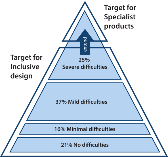
If you're starting a new project, start with inclusive design3 so that it is accessible to, and usable by, as many people as reasonably possible without the need for special adaptation or (specialized) design. Create dynamic personas that cover the various aspects of your target audience, including possible disabilities that they have – after all people come in all different packages. Don't limit yourself to temporary or lifelong physical disabilities, but also consider their cognitive, mental, or emotional state – such as those diagnosed with Attention Deficit Disorder (ADD) and individuals suffering from memory or reading difficulties.

The Inclusive Design Group at the University of Cambridge4 presents the pyramid model of diversity which can be used to show how inclusive design aims to extend the target market. Source: Inclusive Design Group at the University of Cambridge
Tips to Improve Accessibility
Here are some tips to keep in mind while working on new or existing projects.
Leverage Tools but Understand the Guidelines
- There are multiple tools out there to help test the accessibility of your project. Try them all out and decide which ones work best for your needs. See our small list of testing tools below.
- There are a variety of standards you can use as guidelines – see Guidelines below for more details. Select the set of guidelines that meet your needs and work toward compliance.
- There are classes you can take to become certified, but you don't need to be certified to start making changes.
General Usability
- Clear and non-assumptive instructions are present at the start of a form. If any field is expecting a specific format, include either placeholder text and/or a note describing the expected format.
- The steps to progress through the site to accomplish a task are simple and straightforward. The iconography used matches the actions and if they don't, there are explanations for them – such as labels.
- Display a message to users who need to have Javascript disabled. If Javascript is required for a specific action, make sure to state that in the message. If applicable, users are able to accomplish the critical tasks without Javascript enabled.
- Provide the user a way to review content before submitting if it's an irreversible step or you can provide a back button for them.
- Make sure link text describe what will happen when a user selects them or at least the title attributes of the anchor elements describe what will happen.
HTML Validation & Semantic Elements
- Run your HTML code through a validator to show you where you can improve.
- Use semantic markup, as much as possible.
- Use the ARIA roles correctly.
Keyboard Navigation
- The keyboard navigation makes sense – i.e. it doesn't jump around the page in an unexpected way.
- Individuals are able to interact with all major functions using the keyboard.
- Verify that users don't get stuck on any part of the page.
- There is a "Skip to Main Content" link as well as a skip link for repeated elements of a page.
Visual Contrast & Hierarchy
- Use tools to verify that the contrast is correct.
- Use text indicators or additional visual cues of things denoted by color only.
- Make sure there is an obvious visual hierarchy when it comes to text.
- Users should be able to use either a custom zoom in/out functionality or the native browser functionality to view text better.
Screen Readers
- Go through your project with a screen reader – such as VoiceOver, ChromeVox, or JAWS.
- The screen reader should be able to read everything as someone without the need for the screen reader plus any additional descriptive labels. For example, make sure that any content that is dynamically revealed, such as tooltips, are readable by the screen reader.
- The "Skip to Main Content" link for repeated content is also helpful for audible navigation of the site.
- Users are able to go through the processes of your site via screen reader guidance.
Multimedia (Images, Videos, Audio, Charts & Tables)
- If you have flashing assets, don't exceed the recommended flashing frequency to accommodate people who suffer from seizures.
- If audio plays on load of the page, it either lasts for up to 3 seconds or a link is provided to pause/stop the audio as the first or second item on the page (for keyboard navigation).
- Make sure the images have descriptive alt attributes.
- For videos, provide the option for captions as well as transcripts. Transcripts should also be provided for audio files. For videos, consider creating a version with audio descriptions – see Example of Video Audio Descriptions.
- Consider providing long descriptions for chart and tables which provide a summary of the data visualized.
On-Site Assistance
- Provide an accessible help link on every page.
- On your help documentation, consider having text, images, and video with audible explanations for tasks that take more than 3 steps to complete to help individuals help themselves.
- Optionally, consider including an accessibility page explaining everything the site has done for accessibility, similar to a Term of Use page.
Page Content Flow
- Turn off the styles and read through the page flow. Does it make sense?
- Does the outline of the document make sense? Use heading elements for items that will provide structure to the page, not for aesthetic reasons.
- Some browsers provide an option to toggle to a "No Distractions " view (also know as "Reader View") where all the images and styles are removed and only displays the text as if reading the page on an e-reader. Does your content hold up to those features?
Take it Slow and Steady
These tips take into account but a fraction of the different guidelines for web accessibility. If you take a gander at the guidelines you might feel overwhelmed but remember to take it slow but continue to make an effort to develop accessible projects. The more you're able to learn the more you'll be able to implement.
How to Contribute
If you are interested in contributing, there are various ways to help. You can create modules to help Developer test their projects – such as the list of contributed modules to help with accessibility for Drupal; contribute to the various browser extension tools used for testing; contribute to community tools such as A11Y Style Guide built to help developers' lives be a bit easier; and, lastly, you can also join the conversation regarding the new Web Content Accessibility Guidelines (WCAG) 2.1 that is currently being drafted.
One of the largest conversation topics that is happening (or, rather, that should be happening) is how mobile should be considered when writing the guidelines. Since mobile is such a large part of our everyday life as a society, how are people with disabilities leveraging this technology and how can we help them perceive, understand, navigate, interact, and contribute to the Web in a more pleasant manner.
Alternatively, you can also get professionally or technically certified as a Certified Professional in Web Accessibility (CPWA) and help companies, organizations, and institutions with their online presence.
Resources
ActiveLAMP is still in the process of improving their knowledge of ways to enhance accessibility on the web. These resources have been very helpful to us and be may help to you as well.
Guidelines
- Section 508 Guidelines
- Web Content Accessibility Guidelines (WCAG) 2.0
- Web Content Accessibility Guidelines (WCAG) 2.1 [DRAFT]
Testing Tools
Browser Extensions
- WAVE Evaluation Tool (Chrome)
- Chrome Reader View (Chrome)
- View Crit CSS (Chrome)
- Long Descriptions in Context Menu (Chrome)
- Accessibility Developer Tools (Chrome)
- aXe (Chrome, Firefox)
- FireEyes (Firefox)
Screen Readers
General Tools
- Web Accessibility Evaluation Tools List from the Web Accessibility Initiative
- 508 Technical Tools and Resources from the U.S. General Services Administration (GSA)
- W3C's Markup Validation Service
- AC Checker, Web Accessibility Checker
- Tenon
- A11Y Style Guide is a living style guide, generated from KSS documented styles, that have been tested for accessibility.
Example of Video Audio Descriptions
Learn More About the State of Web Accessibility
- Americans with Disability, Jun. 2017
- Disabled Americans are less likely to use technology, Apr. 2017
- Inclusive Design: Making The Web Accessible for All, May 2017
- Inclusive Design Group at the University of Cambridge
- Web Accessibility Initiative
- International Association of Accessibility Professional
Do you have any advice for beginners, feel free to add it in the comments below – let's share our knowledge.

